Case Study

The Problem
The Goal

User Research
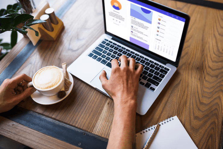
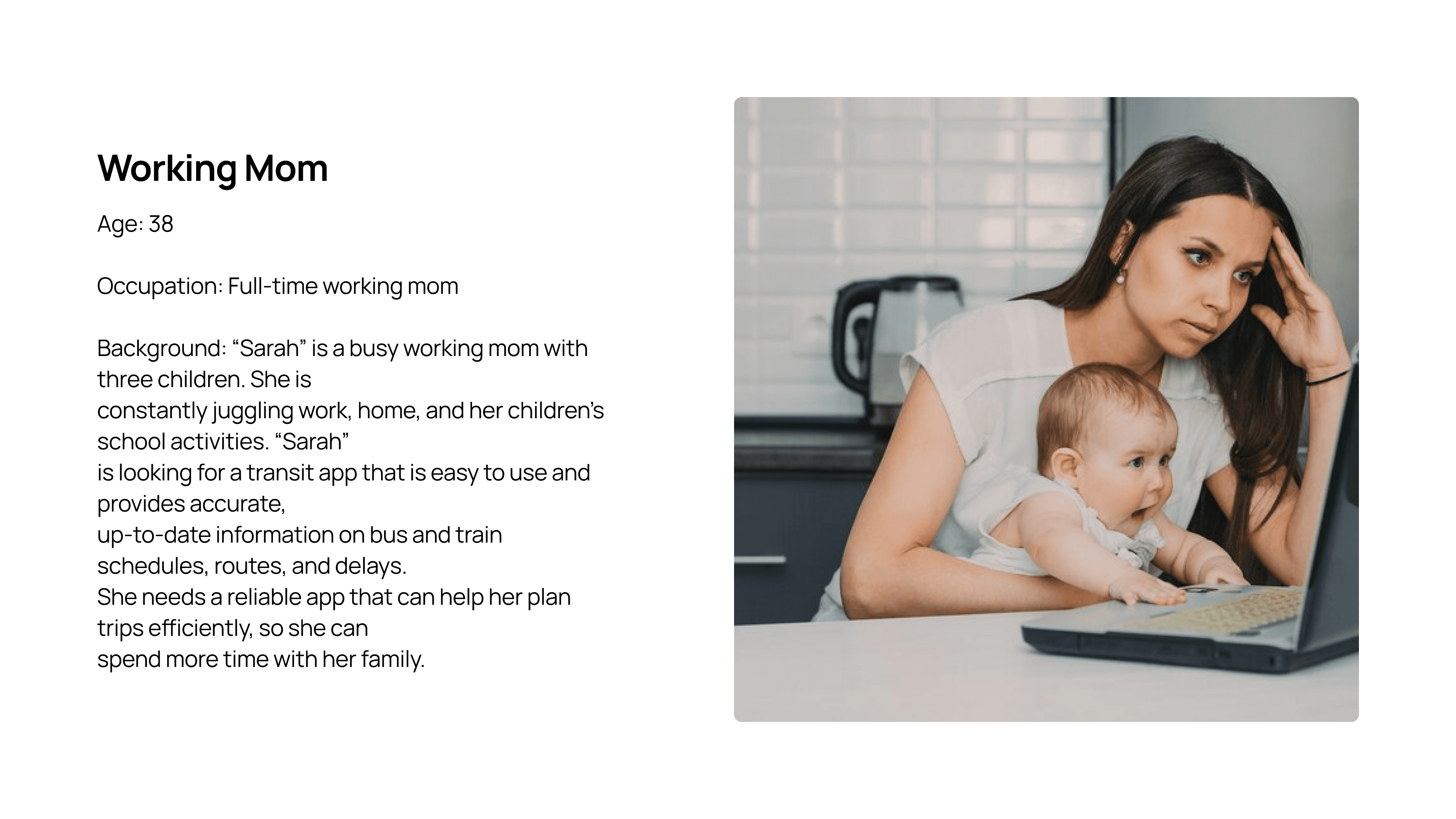
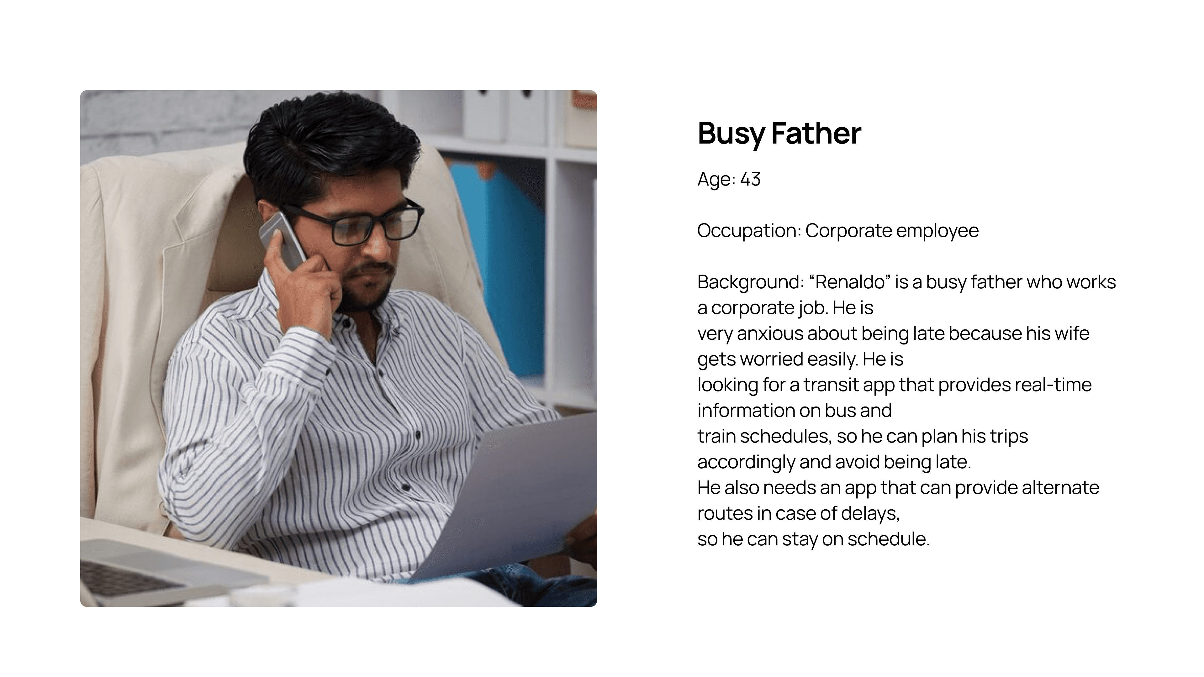
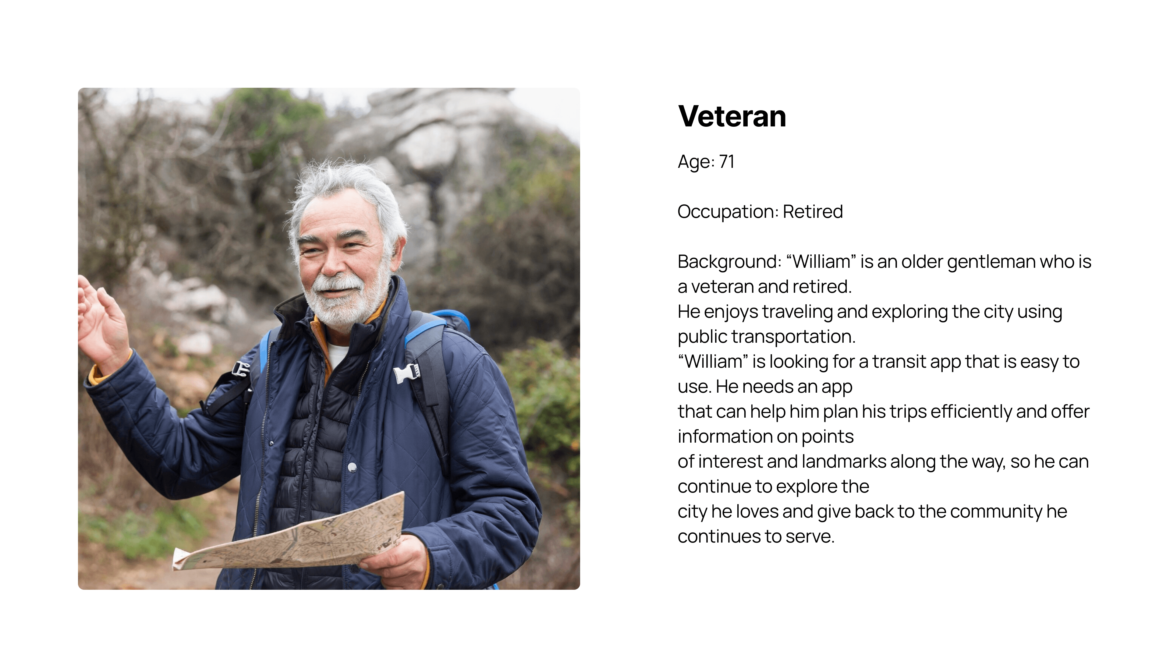
Prioritize quick access to schedules and saved routes for efficiency. Pain points included slow load times and cluttered menus.
Need intuitive navigation and clear transit schedules. Confusion with jargon-heavy terms and complex ticketing flows is to be avoided.
Clear instructions, real-time updates, and seamless ticket purchasing are desirable. Visual clarity and voice-guided options help a lot.

Personas

Final Designs
User-Centric Navigation
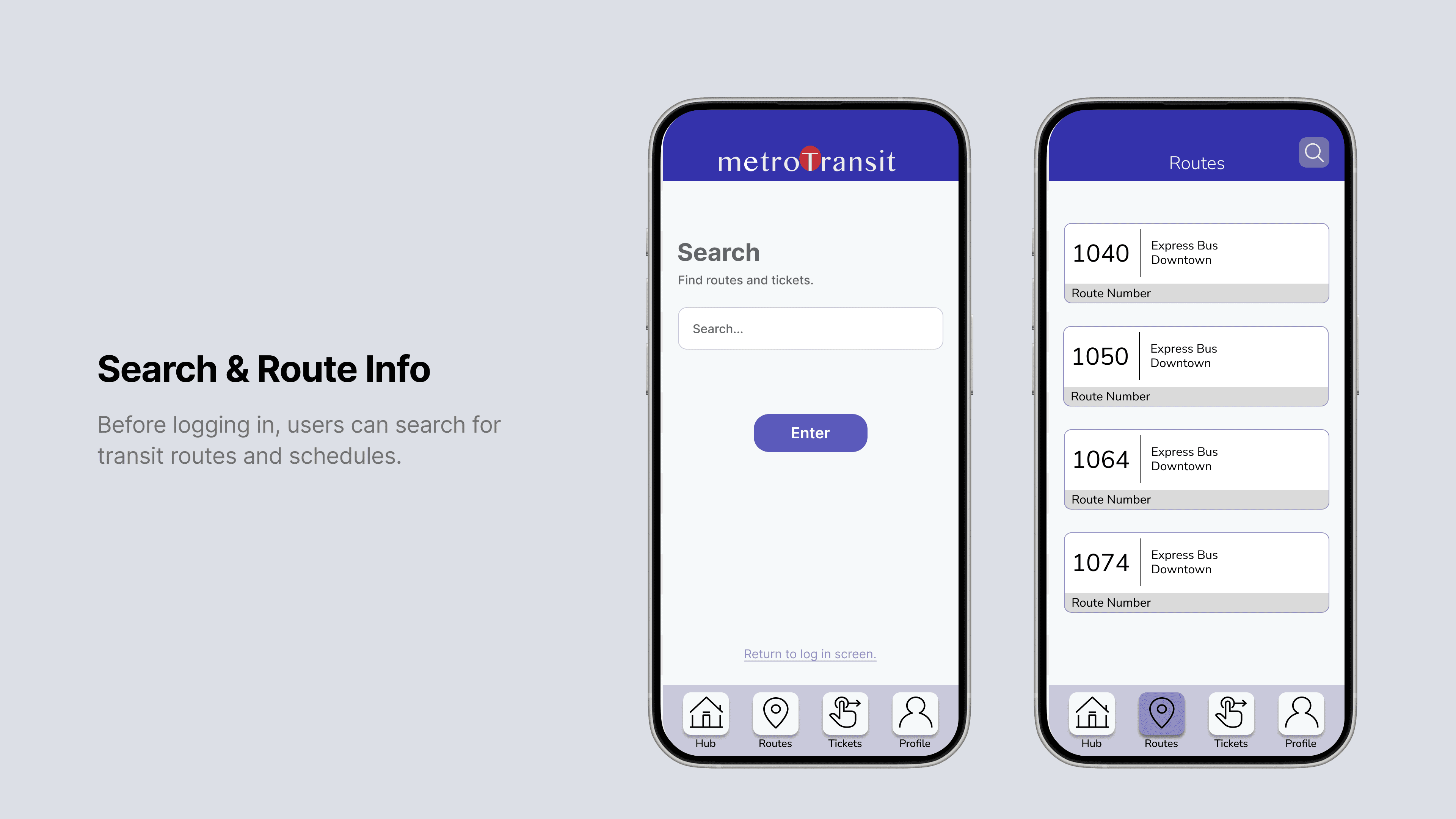
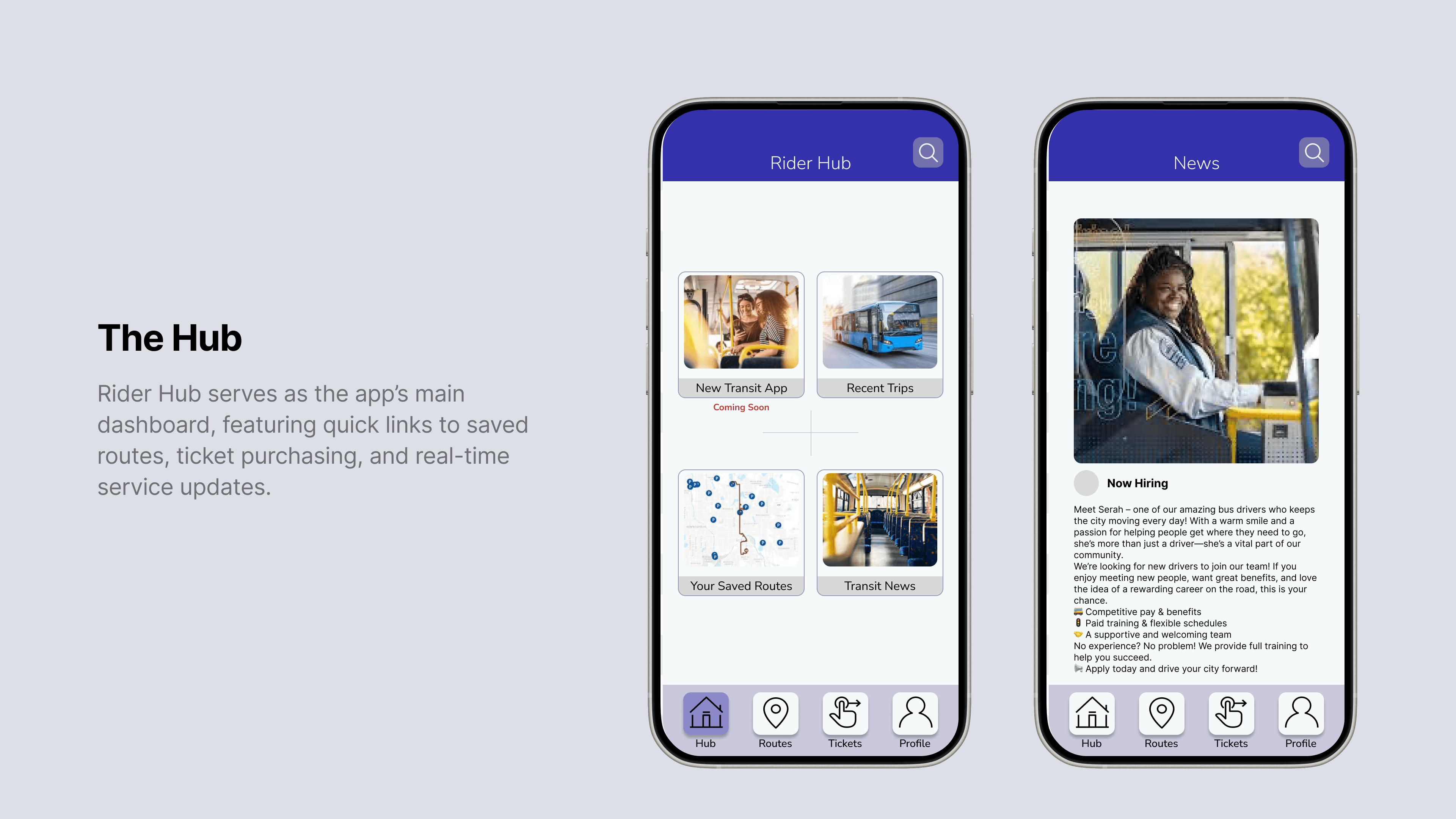
Streamlined interface with real-time transit updates, ensuring effortless route planning and scheduling.
Inclusive features like high-contrast modes and voice-guided navigation for seamless use by all.
Clean, bold color schemes inspired by urban landscapes, paired with smooth animations for a visually engaging experience.
Design Process
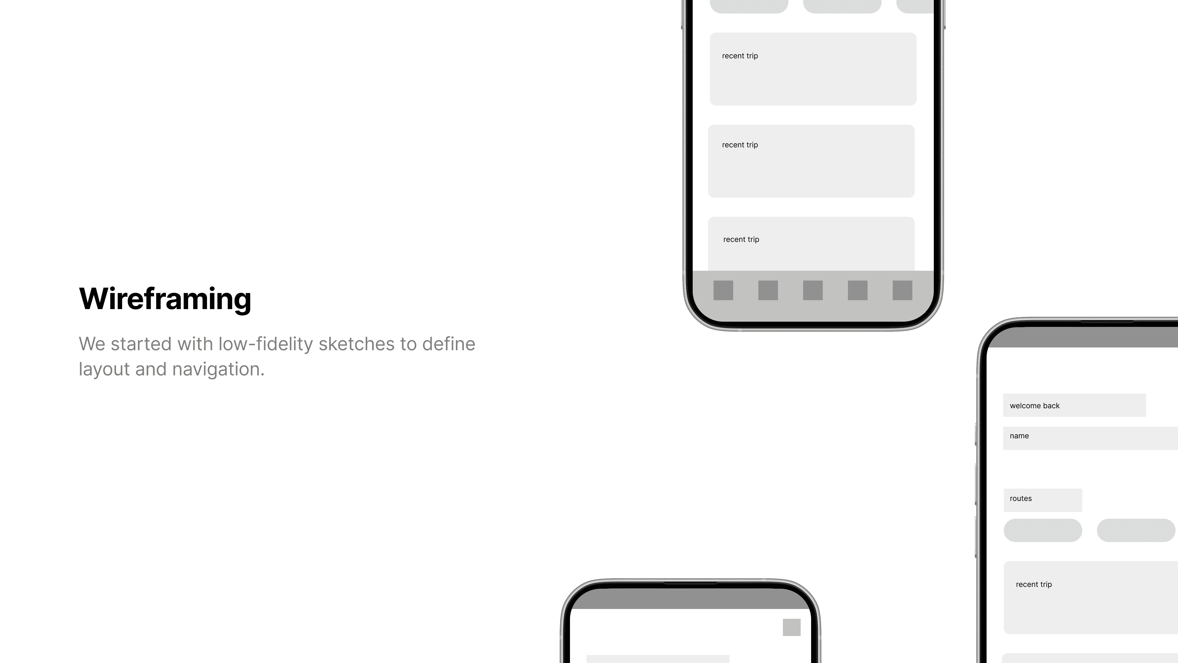
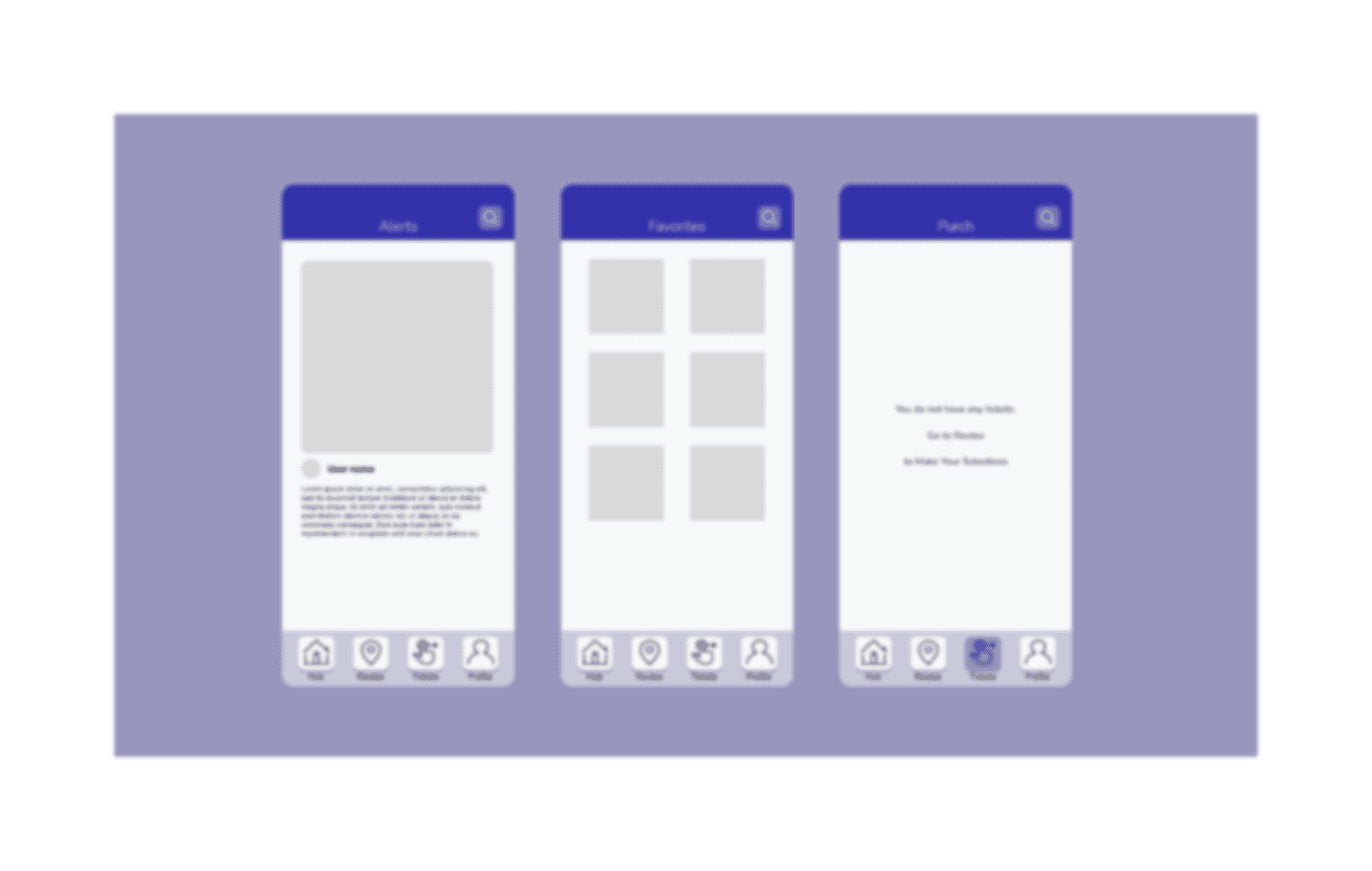
Using Figma, we translated sketches into digital wireframes, refining the UI.
We built low-fidelity prototypes in Figma to test core flows
We conducted usability testing with participants
Style Guide
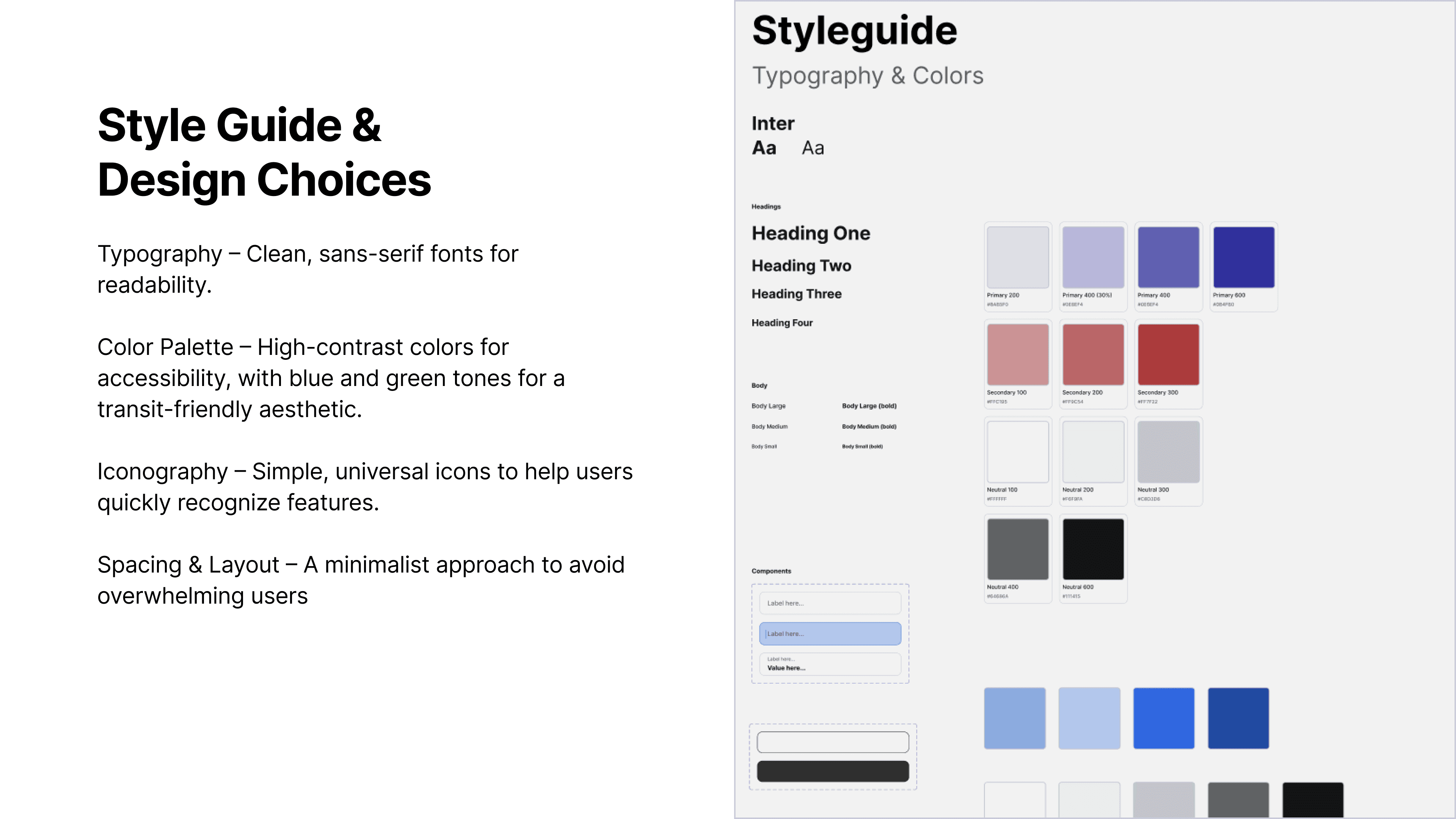
The style guide embraced a pleasant aesthetic while ensuring modern usability.
Monospaced, open-source for headers and body text, evoking a terminal-like feel. With scalable options for accessibility.
High-contrast palette with purple for accents, dark gray for backgrounds, and white for text. Secondary colors included.
Icons for tickets, routes, and alerts, ensuring clarity at small sizes.
User Flow
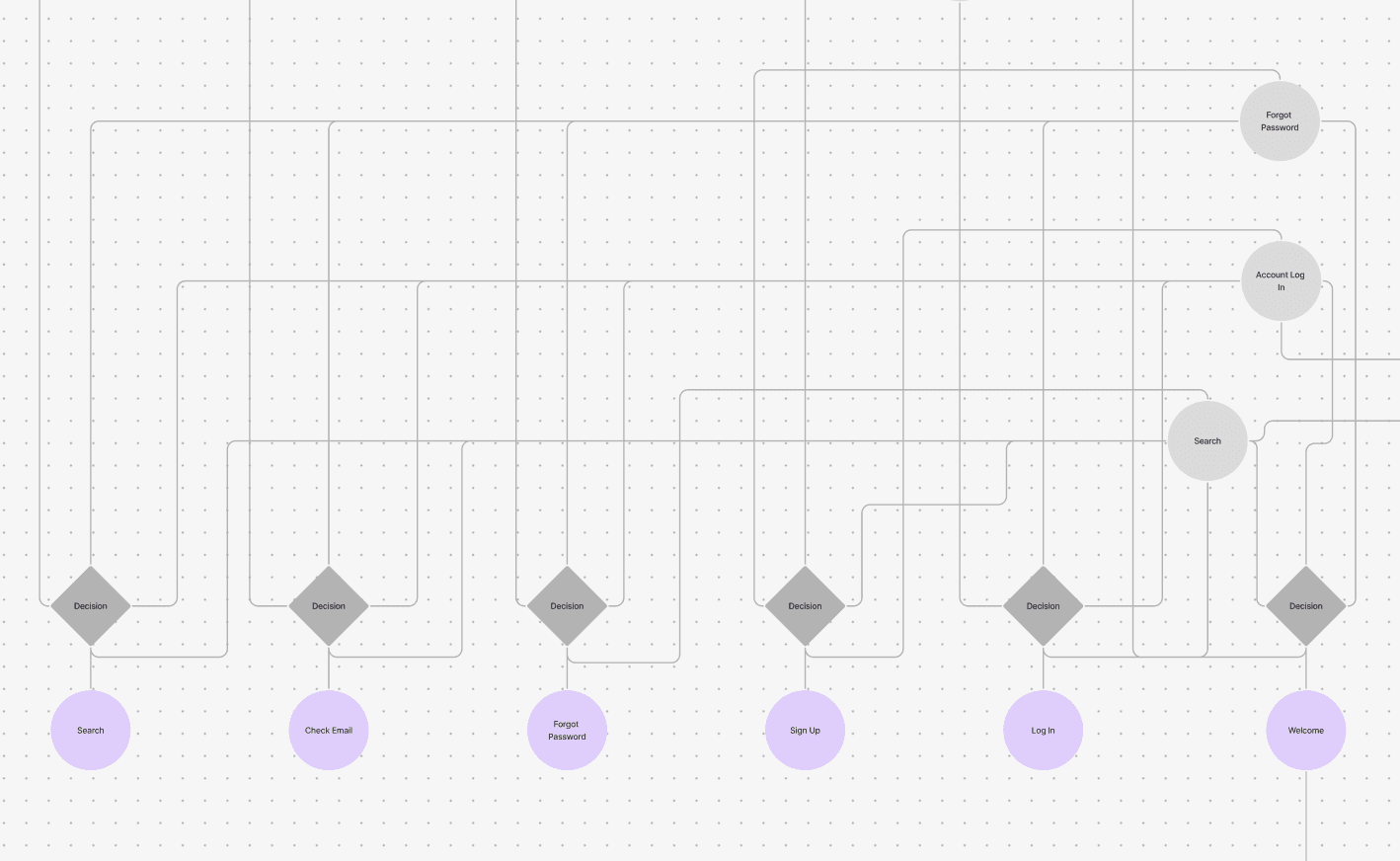
Each flow was streamlined to reduce friction.
The app empowers commuters with a streamlined Trip Planner that delivers real-time bus and train routes interface, guiding them onward with minimal taps.
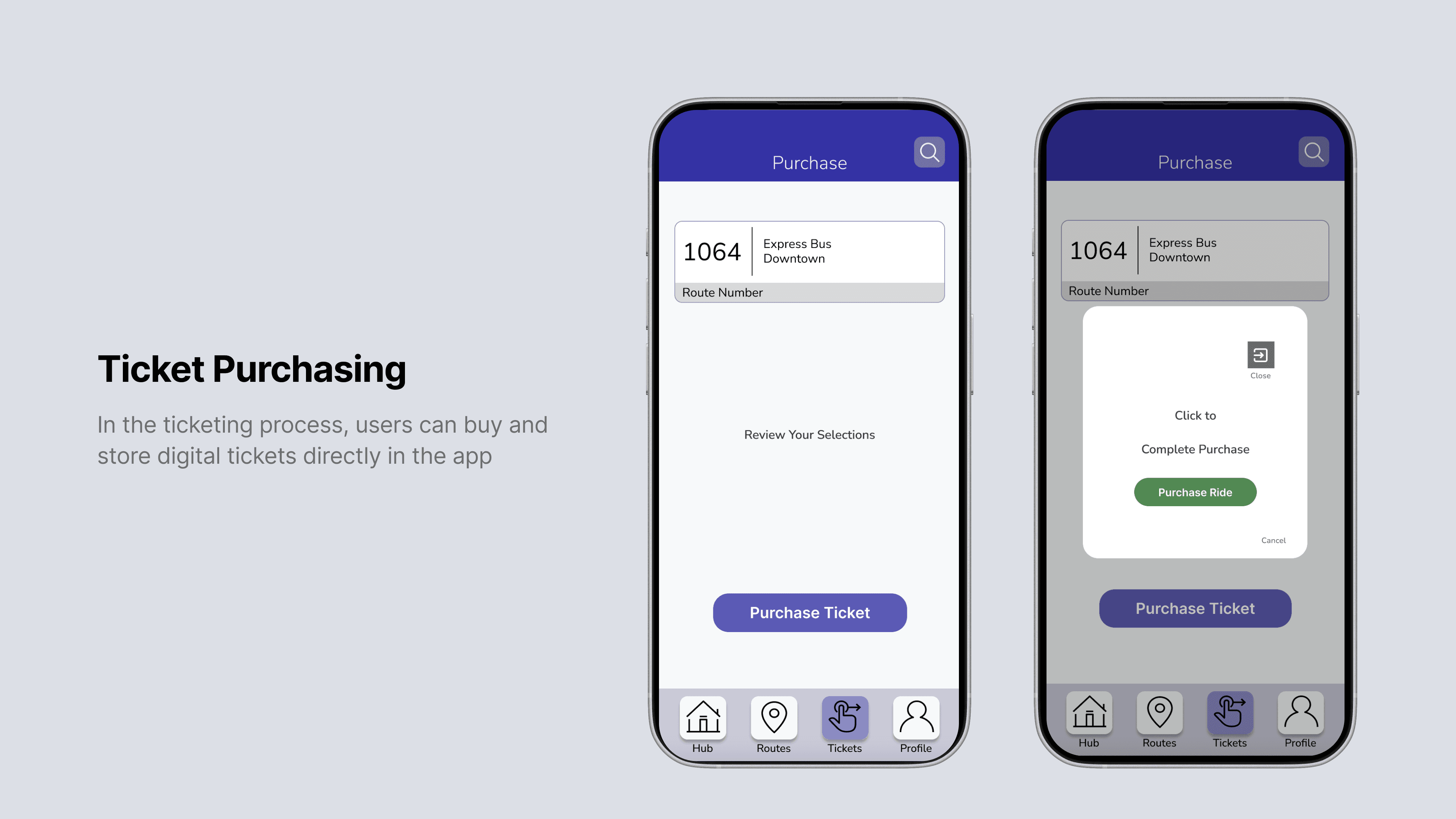
For occasional riders, the app’s redesigned Ticket Purchase flow offers a three-tap process to buy and store mobile tickets using secure payments.
The app’s Accessible Navigation enhances inclusivity with high-contrast visuals, monospaced text, and simplified menus, moving riders onward.
The Team
Our skilled UI/UX design team, creating intuitive and engaging designs with a straightforward, genuine approach.


User Research
Prioritize quick access to schedules and saved routes for efficiency. Pain points included slow load times and cluttered menus.
Need intuitive navigation and clear transit schedules. Confusion with jargon-heavy terms and complex ticketing flows is to be avoided.
Clear instructions, real-time updates, and seamless ticket purchasing are desirable. Visual clarity and voice-guided options help a lot.
User Research
Prioritize quick access to schedules and saved routes for efficiency. Pain points included slow load times and cluttered menus.
Need intuitive navigation and clear transit schedules. Confusion with jargon-heavy terms and complex ticketing flows is to be avoided.
Clear instructions, real-time updates, and seamless ticket purchasing are desirable. Visual clarity and voice-guided options help a lot.
How We Work
We delve deep into understanding your brand, target audience, and objectives, unraveling the insights that will shape our creative journey.
Armed with insights, our design experts bring concepts to life, seamlessly blending aesthetics and functionality for a visually stunning and user-centric experience.
We iterate tirelessly, refining our designs based on feedback, ensuring every pixel and interaction aligns perfectly with your brand identity and user expectations.
The culmination of our collaborative efforts results in the delivery of a polished, cohesive digital experience that not only meets but exceeds your expectations.